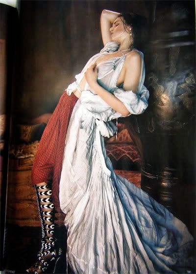
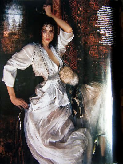
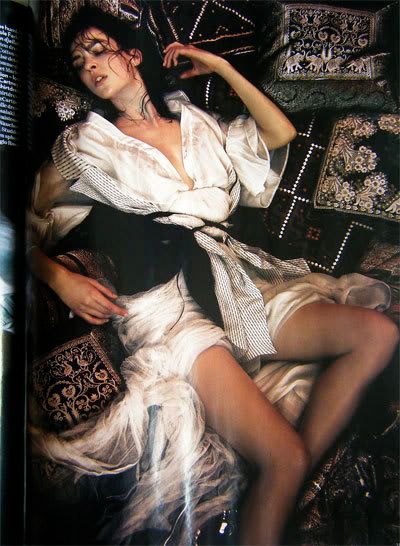
However I think they shot themselves in their bejewelled feet in the way they arranged the Orient Excess story.


[Images: Javier Vallhonrat for Vogue UK]
Two enticing double page spreads, then a two page article by Syrian writer Rana Kabbani about the decline of the Ottoman empire, as experienced by her grandmother. The writing is evocative, fierce and deeply saddening, and makes no bones about the author's contempt for the sensationalism of the western view of the harem, and the popular view of women's place in this much romanticised world. She goes to great pains to separate her [and her family's] first-hand experiences of it from the salacious image many people retain, and describes it as a place where women of the time could convene, converse, work, entertain, rest, learn from each other and be themselves, 'relieved of the intrusive presence of their men'.

[Image: Javier Vallhonrat for Vogue UK]
Following this intelligent, thought-provoking article with 6 pages of a semi-orgasmic white model, surrounded by diaphonous silks, her hair clinging sweatily to her face and throat as she arches backwards on piles of cushions, rather suggests that the photo editor, the features editor and the person who put the page order together did not have a conversation. The images are superb in every way but they're let down by the context they're placed in. If Vogue had run these images before the article, letting them stand for themselves in their beauty and then having the article offer a social and historical counterpoint, I think it would have been more successful; as it is, I wouldn't be surprised if the author felt rather insulted.
Nevertheless, it's still a beautiful feature, and one I'll keep and look at again.
I also really love the Tim Walker feature [he of this much-adored photograph]; I want to tear out all the photos and spread them across my walls like one of his scrapbooks. I'll definitely be going to his show at the Design Museum.

3 comments:
A good reveiw compared to my sniping 2 sentnaces of June Vogue.
I couldn't marry the words and images either in lots of articles. The Tim Williams article was at odds with his strong colourful defined photos - he was portrayed as some sort of magical sprite living in a Grimm brothers world.
I love vogue for its fantasy, presentation and actually you can't beat the baeauty section always a great read but I'm not enjoying the writing elsewhere.
Agreed. Though it isn't nearly as creative or visually arresting, as far as mainstream glossies go I find Bazaar a far more solid read because the writing's less sensational and has a little more basis in fact. Vogue remains my favourite but it doesn't satisfy as often these days.
With the Tim Walker piece I was sad that they decided not to show the images they described the most lovingly! Still, I'll definitely go to his show.
Beautiful !
Post a Comment