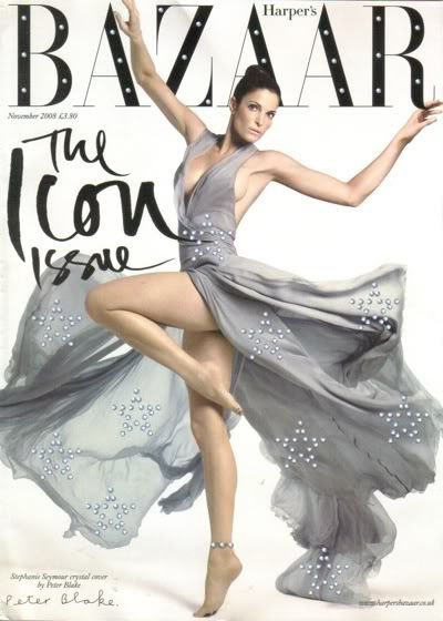
How timely to run an issue of icons, of people that never go out of style and clothes that never lose their cache. It's rather comforting to flick through the pages of their '40 classic pieces' article. It could have been dull, but typically for Bazaar, there's enough elegance to the pieces they suggest and enough sense to their arguments for them, to make me return to my own wardrobe and remind myself that I really don't actually need to add to it right now.
Is it just me that isn't at all impressed by Peter Blake these days though? Oh, British institution, fiddlesticks. Sgt Pepper is all well and good, but what's he up to now? 'Designing' the cover of the magazine with Swarovski crystals by sticking them in doltish stars at obvious points on the photo? Yes, very good, well done. Pfft. There was another piece of his in the magazine, I forget where, but if I'm sufficiently annoyed when I get home this evening, perhaps I'll scan it in. Not impressed.

6 comments:
Oh I'll have a peek at this now instead of steadfastly ignoring it!
I don't know what got me started reading it - it wasn't one of the magazines I grew up with. I'm usually impressed by the fact that it manages to convey Vogue-esque glamour [it's definitely aimed at ladies who earn a whoooole lot more than I] but avoids much of the flashy idiocy of its competitors. The new season coverage a few issues back was superb, really beautifully and comprehensively laid out, and the writing tends to be pretty good.
Hey Charponnaise, you been tagged. Do it!
I'll need to find that issue, so I can see what you mean.
I like Stephanie Seymour on the cover, the classic idea is brillo, as you say.
I just discovered your blog and I love it! i love your blog style. :)
honestly, the only thing i like about the cover is type face for 'the icon issue.' haha. but perhaps i shouldn't judge a cover and open the damn thing.
Post a Comment